
MAKE YOUR WORDS IMPOSSIBLE TO IGNORE
Upload a photo or let our AI build you a background. Add your quote, tweak the look, and download a share-ready image — all in under a minute.
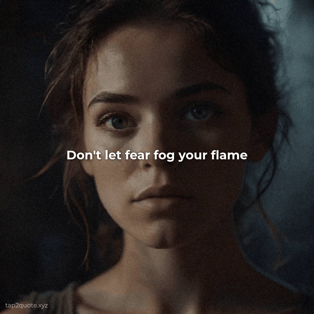
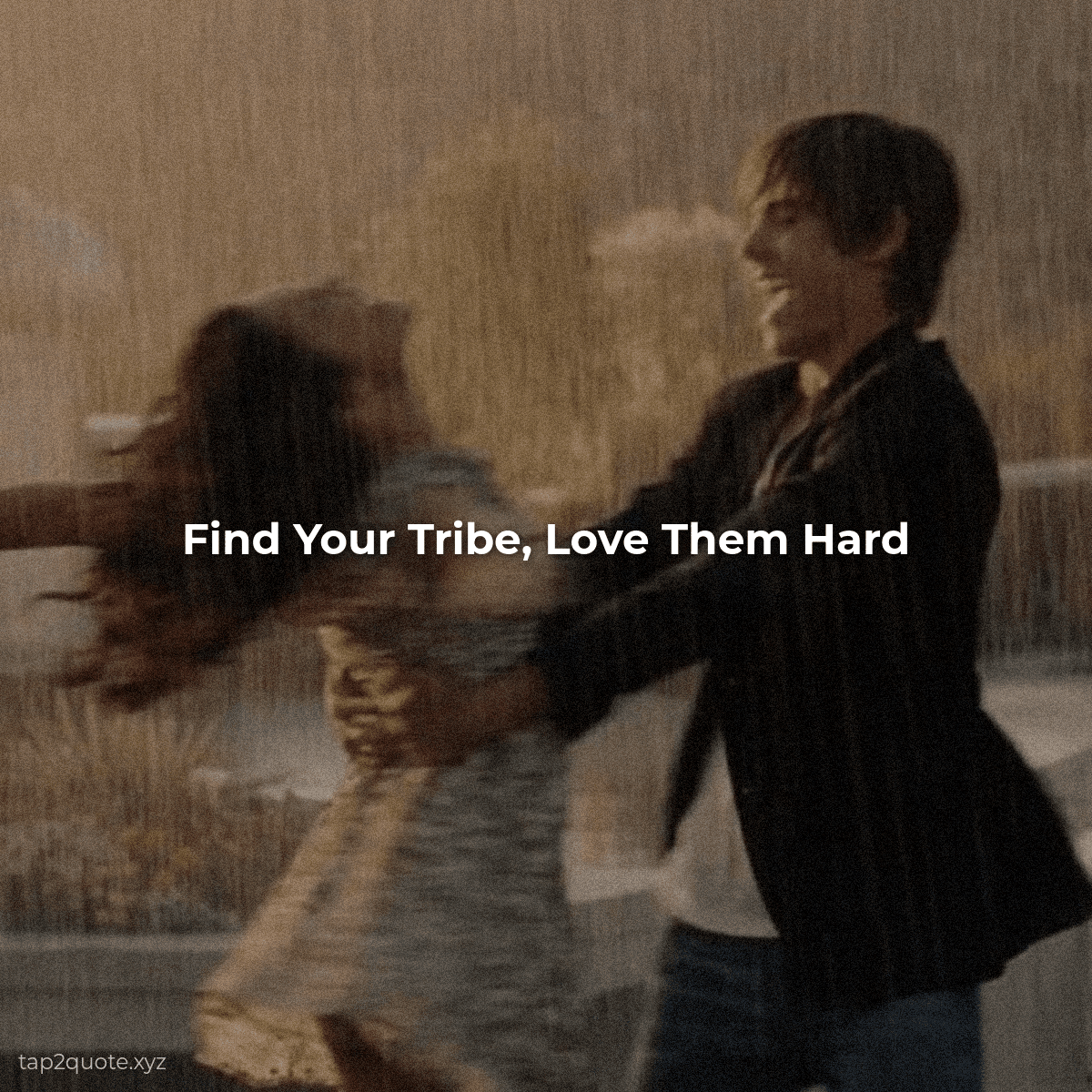
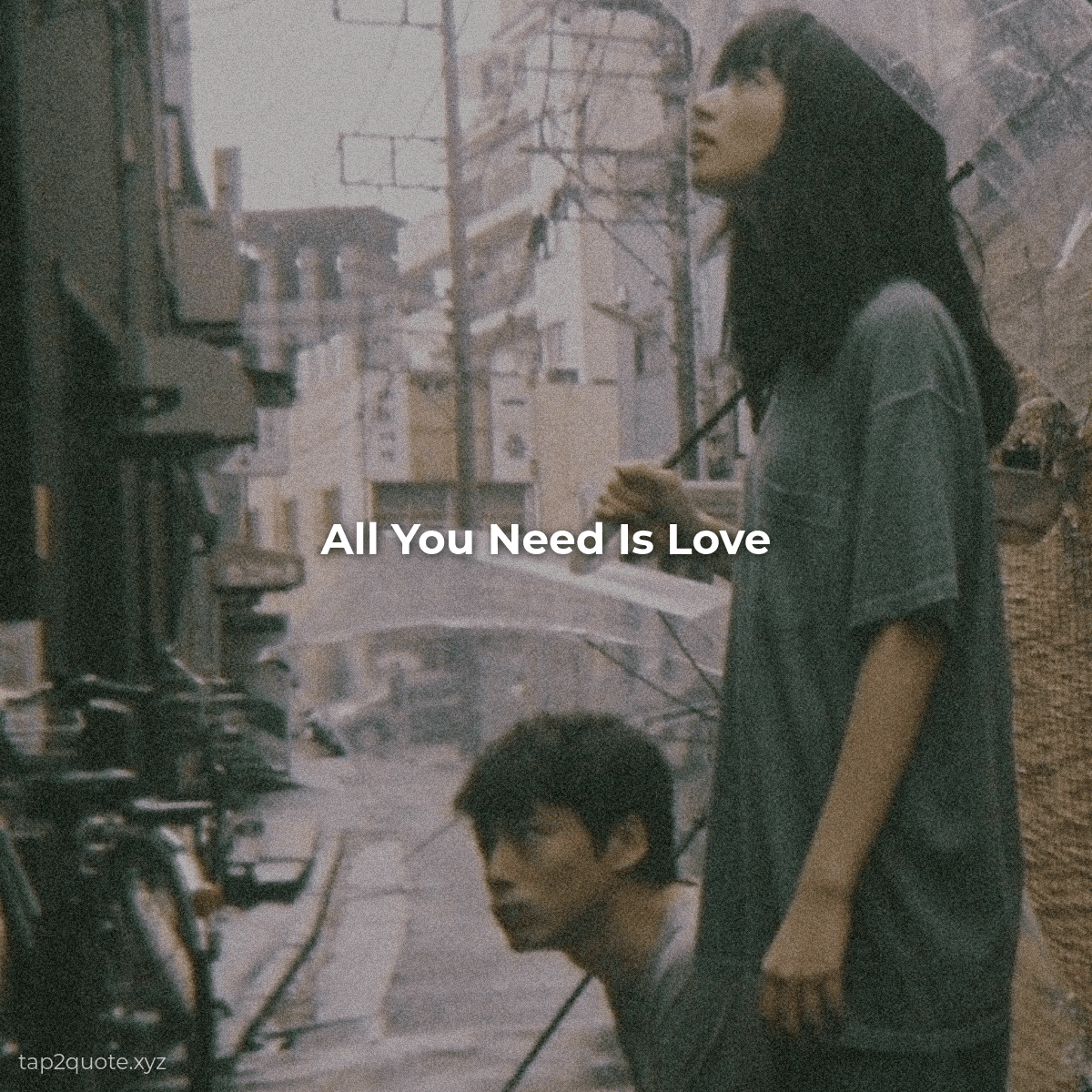
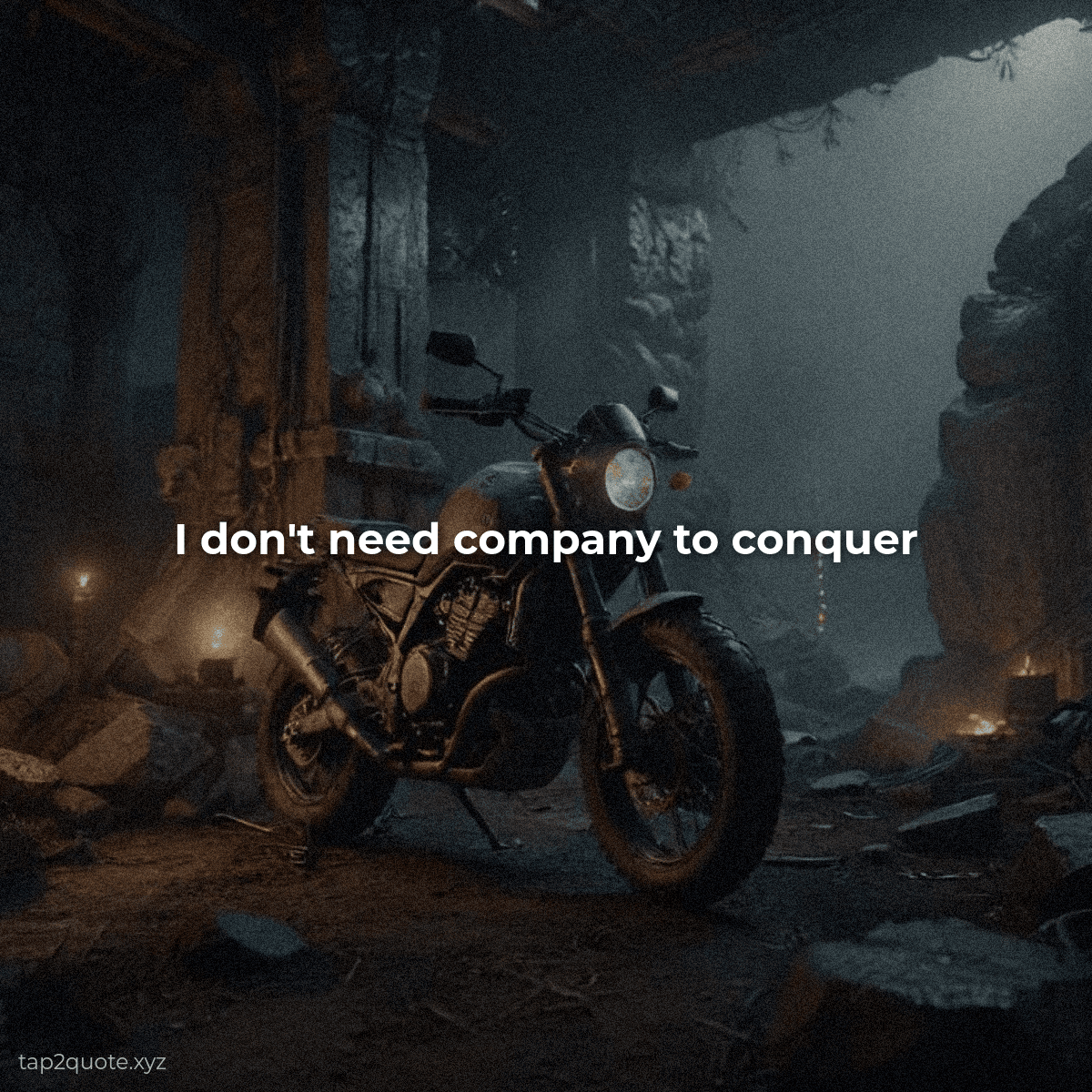
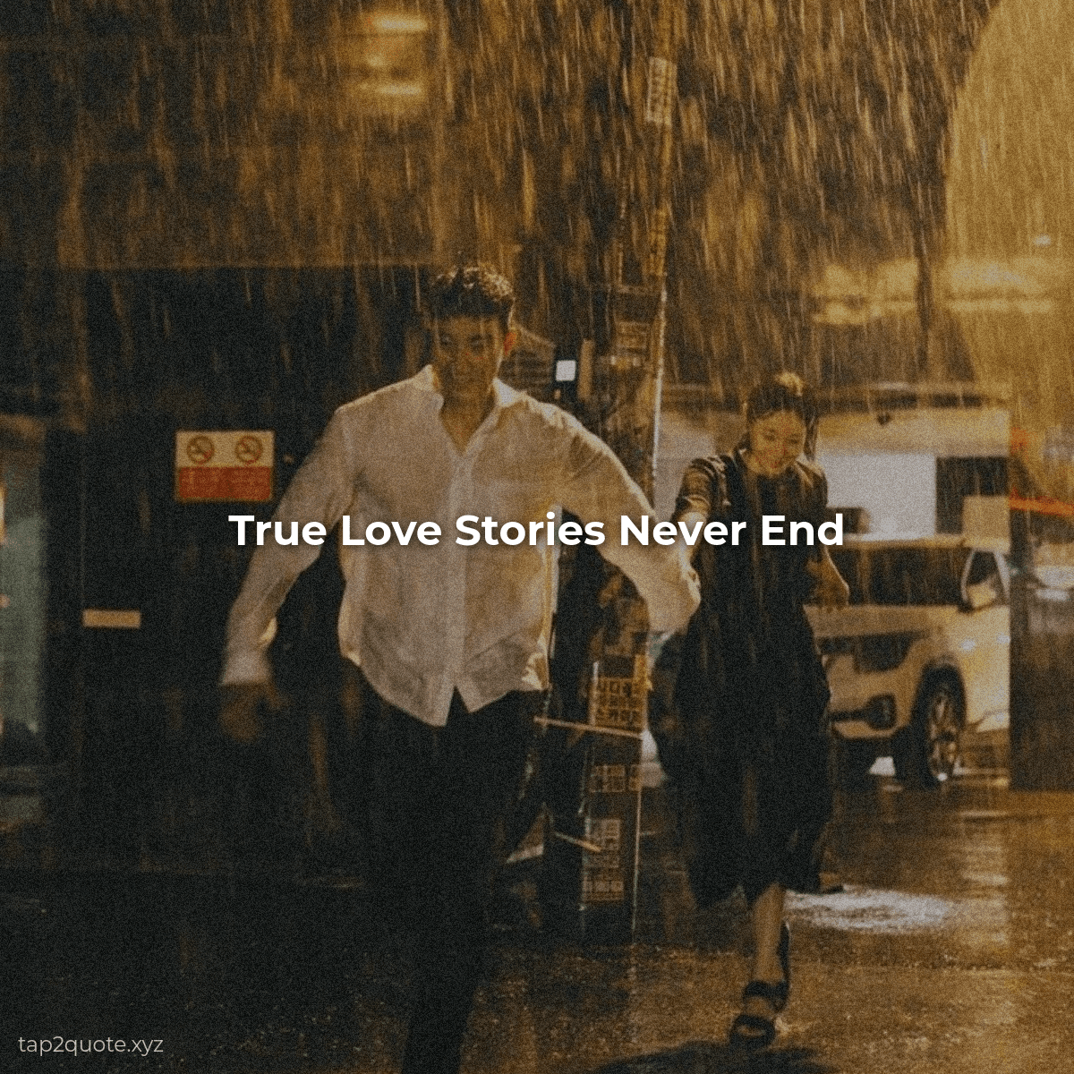
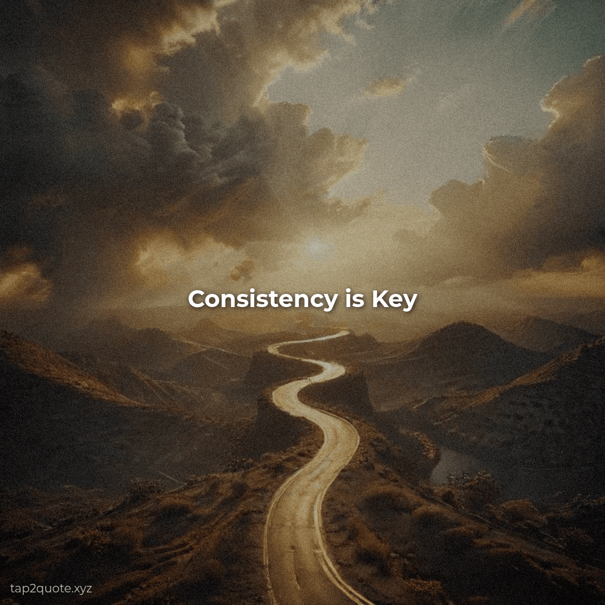
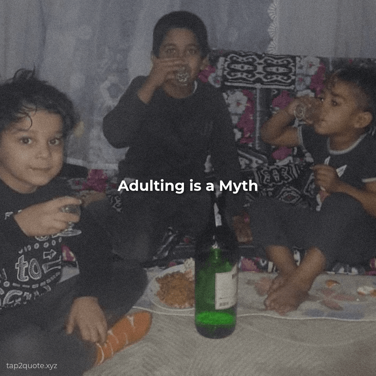
Trusted by creators on
See It in Action
FROM QUOTE TO IMAGE IN 15 SECONDS
No sign-up. No watermarks. Just paste, style, and download.
HOW IT WORKS
We built TapToQuote so you can make clean, readable quote images without fiddling with complex design tools. Everything happens right here in your browser.
Pick a background — upload your own photo or generate one with AI
Type your quote and pick a font that matches the mood
Download a high-res image ready for social media
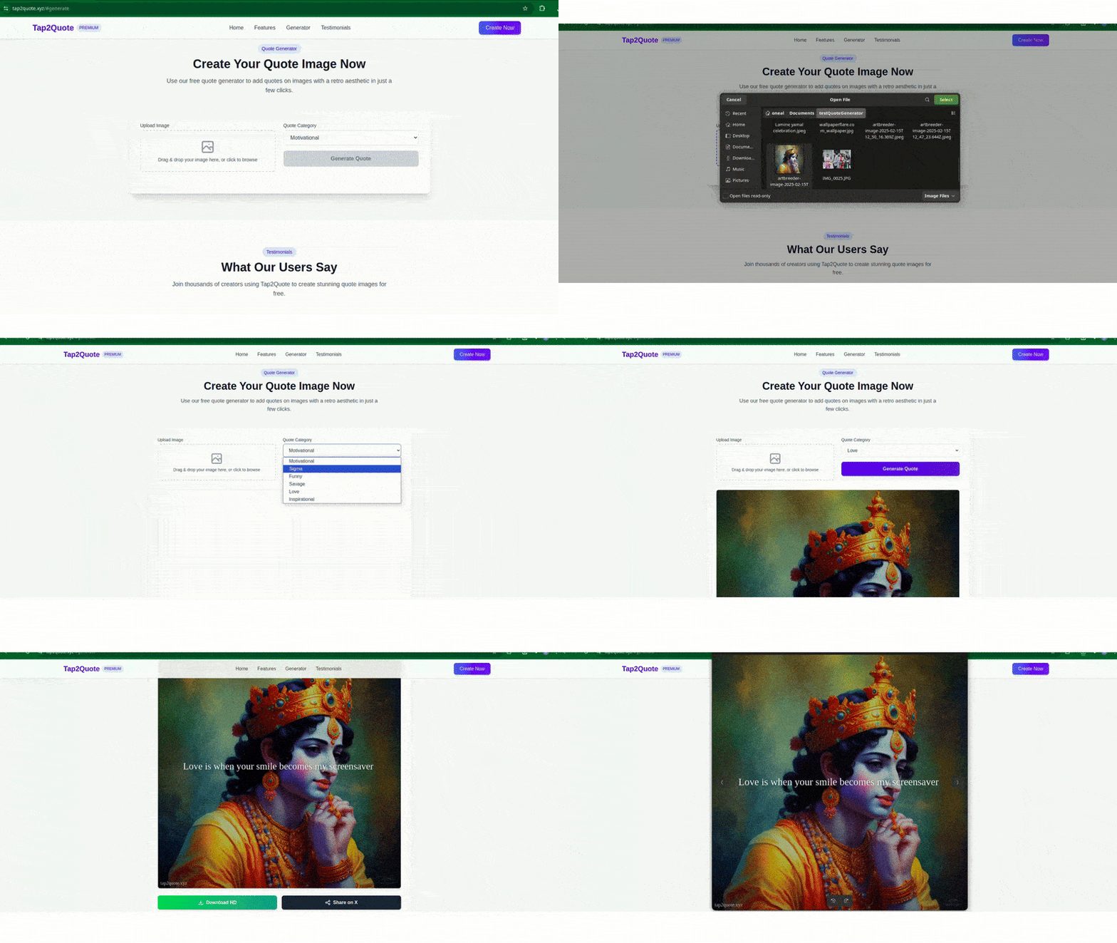
Watch the 15-second walkthrough
UPLOAD OR GENERATE
Drop in your own image or let the AI create a custom background for you.
WRITE YOUR QUOTE
Type your own words or pick from our library of motivational, funny, and bold quotes.
DOWNLOAD & SHARE
Export a high-quality image and post it anywhere — Instagram, TikTok, X, you name it.
Features
WHY CREATORS PICK THIS
Every feature is designed to get you from idea to finished image as fast as possible — without compromising quality.
AI Backgrounds
Describe a scene and the AI generates a matching background. No stock photos, no searching — just your idea brought to life.
Retro Aesthetic
Every export gets a subtle grain texture and boosted color — that warm, analog look that makes people stop scrolling.
Always Free
No paywall, no trial period, no "upgrade to unlock" buttons. Every feature is available from day one.
Instant Export
Hit download and the image is on your device in seconds. PNG format, high resolution, ready for any platform.
Full Control
Adjust font, size, color, position, borders, and aspect ratio. You decide exactly how the final image looks.
Social-Ready Sizes
Pick from square, story, widescreen, or classic ratios — each one optimized for the platform you're posting to.
Quote Library
Can't think of what to say? Browse curated collections — motivational, sigma, funny, savage, love, and inspirational.
Quote Generator
CREATE YOUR QUOTE IMAGE
Most quote posts fail for one simple reason: the text isn't readable, or the font fights the message. This generator keeps the basics right for you. The text is placed with high contrast in mind, every export gets the retro grain and color treatment, and you can pick a ratio sized for the platform you're posting to. Upload a photo you took, or describe a scene and let the AI build the background. Then write your own words or pull a line from the library, adjust the font, size, and position, and download a share-ready image in about thirty seconds.
No account, no watermark, no cost. Everything the generator can do is available to everyone — we keep the lights on with advertising instead of paywalls. If you're new to making quote images, the design guide further down this page explains how to choose fonts and colors that actually stand out in a feed.
AI Image Generator
Drag & drop or click to upload
Preview
Once you apply your quote, hit download to get a high-quality image with the retro aesthetic baked in — font size, color, and positioning are all applied automatically.
Your image will appear here
Design Guide
MAKING QUOTE IMAGES THAT PEOPLE ACTUALLY READ
A practical guide to readability, contrast, and choosing the right font for every kind of quote.
Start with Readability, Not Decoration
Most quote images fail for one boring reason: nobody can read them. Your design can be flawless in every other way, but if the text doesn't stand out the moment it appears on a phone screen, the post gets scrolled past. Readability isn't a nice-to-have on top of a good design — it is the design. Every decision you make, from the background to the font weight to the color choice, either serves the text or fights against it.
The first habit worth building is checking your work at the size it will actually be seen. Quote images are mostly consumed on small phone screens, in a fast-scrolling feed, often in a matter of seconds. If the text only looks good at full size on a desktop monitor, it will fail in the real world. Shrink your preview, step back, and ask honestly: can I read this instantly? If you have to squint or lean in, the image isn't finished.
Contrast Is the Non-Negotiable
The single most important principle in quote design is contrast — the difference between your text and its background. Dark text on a light background, or light text on a dark background, gives your words the cleanest possible separation. Low-contrast combinations like white text on a pale sky, or gray text on a textured background, are the most common reason good quotes get ignored.
When a beautiful background photo makes text hard to read, you don't have to abandon it. The standard fix is a subtle overlay — a semi-transparent dark or light layer placed between the photo and the text. A soft dark overlay under white text, or a light gradient under dark text, gives the words a consistent surface to sit on without ruining the photo's mood. When in doubt, add an overlay. When still in doubt, choose a simpler background.
Color choice matters too, but it works with contrast, not against it. Reserve bright or saturated colors for accent words you want to emphasize, and keep the main body of the quote in a high-contrast neutral. A single bold accent line is memorable; five colored lines are noise.
Matching Fonts to Quote Genres
The right font does more than carry your words — it sets the emotional tone before anyone reads a single sentence. Most fonts fall into four families, and each one suits certain kinds of quotes better than others. Learning to match them is one of the fastest ways to make your images look intentional rather than accidental.
- Serif fonts for wisdom and philosophy. Serif typefaces — the ones with small feet on the ends of letters — carry a classic, established feel. They suit reflective quotes about philosophy, deep thinking, spirituality, and traditional wisdom. When a quote should feel like it was written a hundred years ago, a serif is the right choice.
- Bold sans-serif for fitness, motivation, and confidence. Clean, heavy sans-serif fonts read as modern, direct, and forceful. They're the natural match for fitness motivation, hustle culture, sigma and confidence quotes, and any message that needs to hit hard. The heavier the weight, the more presence the words have.
- Script fonts for romance and personal messages. Handwritten-style scripts feel warm, intimate, and emotional — ideal for love quotes, heartfelt notes, and personal messages. But scripts are harder to read at small sizes, so use them for short quotes or as an accent, never for long paragraphs.
- Clean modern fonts for everything else. When a quote doesn't clearly belong to a category, a neutral sans-serif is the safest and most readable choice. Simple, uncluttered typefaces work across every platform and let the words themselves carry the message.
Whatever font you choose, keep the body readable first and expressive second. A font that looks interesting but requires effort to decode is the wrong font. Readability always wins.
Keep the Message Focused
The best quote images carry one idea and nothing else. If a quote takes more than a moment to parse, it's probably too long for a single image — trim it to its most powerful line. Leave generous space around your text instead of filling every corner. Empty space isn't wasted; it's what lets the message land. One quote, one clear message, one strong font, and clean contrast will outperform a crowded, decorated image every time.
The tools to get this right are free and fast. Pick a photo with room for text, choose a font that matches the quote's mood, apply a subtle overlay when the background is busy, and check the result at phone size before you export. That short checklist is the difference between a post people save and a post people scroll past.
Creator Feedback & Rating
LOVED BY CREATORS WORLDWIDE
“TapToQuote saved me hours every week. I make daily inspirational quotes for my 85K followers. The AI backgrounds match the quote tone instantly and there's never a watermark.”
Sarah Jenkins
Instagram Content Creator
“Cleanest quote generator online. I love the typography controls and aspect ratios for TikTok stories and carousel covers. Instant download with zero login friction.”
Marcus Vance
Fitness & Mindset Coach
“The retro grain effect gives the quote images that warm analog look that stops people from scrolling past. 100% free with premium quality.”
Elena Rostova
Digital Marketer & Author
The Numbers
WHY VISUAL QUOTES WORK
More engagement than text-only posts
Visual quotes consistently outperform plain text on every major social platform.
More shares than other content
People share images with quotes because they want to inspire their own audience.
Average time to create one
Pick a background, type your words, hit download. That's the entire workflow.
Who It's For
BUILT FOR REAL WORK
Content Creators
Build a consistent visual brand across Instagram, TikTok, and Pinterest without hiring a designer. Every image carries your style.
Coaches & Speakers
Turn your best one-liners into branded images your audience will repost. Every quote becomes a micro-piece of marketing.
Small Businesses
Share customer testimonials, product benefits, or motivational messages that reinforce your brand values and build trust.
FAQ
COMMON QUESTIONS
Everything you need to know about our free AI quote generator and picture quote maker.
Yes, completely. There's no paid plan and no locked features — everything the generator can do is available to everyone. We cover the costs of running the site with advertising instead of charging users, which is why there are no watermarks and no sign-up walls.
Absolutely. Upload a JPG, PNG, or GIF from your device and add your quote on top of it. This works well for personal branding, travel photos, or product shots where your own imagery matters. Your photo is processed on your device and never uploaded to our servers, so nothing is stored after you're done.
No. There's no registration, no email verification, no password to forget. You land on the page and the tool is ready immediately. We built it this way on purpose — you shouldn't need an account just to make a quick post.
No watermark, ever. Your images belong to you, and we don't stamp our branding across them. The only text that appears is the small “taptoquote.com” label on the preview example in the hero, and that's not part of the export.
You can pick from square, portrait, story, and widescreen ratios, each sized for a specific platform — Instagram posts, stories, TikTok, Pinterest, and the rest. The retro grain and color boost are applied automatically, and the final image downloads as a high-resolution PNG.
You describe the background you want in a sentence — “foggy mountain at sunrise” or “moody city street at night” — and the AI creates a matching image you can place your quote on. You can also use the AI to write a quote around a theme if you can't find the right words yourself.
READY TO MAKE SOMETHING
WORTH SHARING?
No account needed. No watermarks. Just open the tool, create your image, and download it.
Explore More Resources
POPULAR TOOLS & GUIDES
Free Quote Maker with Picture
Upload personal pictures, add custom typography overlays, and download watermark-free quote images.
AI Quote Generator
Generate contextual AI background visuals and viral captions for Instagram stories and TikTok.
Quote Design Gallery
Explore trending community designs across motivational, sigma, love, and aesthetic categories.
Quote Design Master Guide
Learn font pairing, contrast rules, and aesthetic layout tips to make your social media quotes pop.
User Guide & Documentation
Step-by-step instructions on aspect ratios, custom borders, grain textures, and instant downloads.
Recommended Reading & Insights
Actionable guides to improve your typography, quotes, and social media engagement.